.svg)
DesignPLUS offers you the ability to customize and style Dividers in your content. This includes the use of glyphs, like the starburst in the center of the divider in the following example:
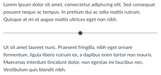
Glyphs used in Dividers are actual characters, not images or even an icon font. If a screen reader encounters the glyph it would read it as the symbol. However, Dividers are usually either ignored by a screen reader as a decorative element or identified solely as "separator."
As such, Dividers should not be used as the sole means of separating chunks of content. They should be used as visual flair, in conjunction with proper Heading styles.