.svg)
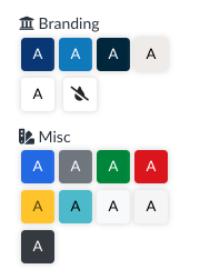 9 additional colors can be customized in the basic color picker in the sidebar under the "Misc" heading. These colors are:
primarysecondarysuccessdangerwarninginfolightmiddark
- New color: Hexadecimal value for the color used for the background color.
- Contrast color: Usually black (
#000000) or white (#FFFFFF) whichever gives the best contrast for the text color. - RGB: The RGB value for the color in a
R, G, Bformat. - Text Color: The original color or a variation that is dark enough to have sufficient contrast when used as just a text color.
- Background Hover Color: A slightly darker or lighter variation of the color that is used when someone hovers over an element that can be clicked that is using that color. The main use case is a Button.
- Border Color: Can be the original color or a slight variation that will be used in some places as the border color when that color is selected.
Note: if you make a change to the CSS colors in the Canvas Theme, the color will apply to every course in the root or sub-account where that variable is used.
This feature is beneficial if your institution goes through a rebranding. The colors can be changed in the CSS and will be applied to the entire root or sub-account.
Examples
Changing the primary color
#content, #tinymce.mce-content-body, .dp-tools-wrapper #previewPanel, .dp-tools-wrapper #appPreviewPanel, .dp-tools-wrapper .color-palette.misc-swatches, .dp-tools-wrapper .dp-color-picker:not(.dp-color-picker-default), .dp-tools-wrapper .link-checker-tool-form .link-preview, #content .dp-wrapper, #tinymce.mce-content-body .dp-wrapper, body #dpPopoutPreview, body #hoverPreview, body #quickStylePreview, body #dpWizardPreview, .dp-wrapper.dp-preview-wrapper, .dp-course-tool-preview-body .dp-wrapper {
/*******************************/
/* PRIMARY COLORS */
/*******************************/
/* Primary color - used for main actions, links, and primary buttons */
--bs-primary: #26b8eb;
--bs-primary-contrast: #000000;
--bs-primary-rgb: 38, 184, 235;
/* Primary color variations */
--bs-primary-text: #135d78;
--bs-primary-bg-hover: #23afe2;
--bs-primary-border: #23afe2;
}
Changing the primary and the secondary color
Note that the second group is nearly identical to the first, just using secondary in all of the variable names where primary occurs.
#content, #tinymce.mce-content-body, .dp-tools-wrapper #previewPanel, .dp-tools-wrapper #appPreviewPanel, .dp-tools-wrapper .color-palette.misc-swatches, .dp-tools-wrapper .dp-color-picker:not(.dp-color-picker-default), .dp-tools-wrapper .link-checker-tool-form .link-preview, #content .dp-wrapper, #tinymce.mce-content-body .dp-wrapper, body #dpPopoutPreview, body #hoverPreview, body #quickStylePreview, body #dpWizardPreview, .dp-wrapper.dp-preview-wrapper, .dp-course-tool-preview-body .dp-wrapper {
/* PRIMARY COLORS */
/*******************************/
/* Primary color - used for main actions, links, and primary buttons */
--bs-primary: #26b8eb;
--bs-primary-contrast: #000000;
--bs-primary-rgb: 38, 184, 235;
/* Primary color variations */
--bs-primary-text: #135d78;
--bs-primary-bg-hover: #23afe2;
--bs-primary-border: #23afe2;
/*******************************/
/* SECONDARY COLORS */
/*******************************/
/* Secondary color - used for secondary actions and elements */
--bs-secondary: #2F2D2E;
--bs-secondary-contrast: #FFFFFF;
--bs-secondary-rgb: 47, 45, 46;
/* Secondary color variations */
--bs-secondary-text: #2F2D2E;
--bs-secondary-bg-hover: #3b3839;
--bs-secondary-border: #3b3839;
}
primary, secondary, success, danger, warning, info, light, mid, and dark . You only need to include what you want changed.If you would like assistance updating the Miscellaneous CSS colors, please fill out the Cidi Labs Support Form to submit a support ticket. Please send which color variables you would like to replace, along with their new hexadecimal values for those colors.
Where do I apply these colors?
If you would like to replace the colors at the root account, the colors need to be applied to the Global CSS file in the Canvas Theme Editor. This needs to be done by a root account admin.
If you would like to replace these colors at the sub-account, the colors need to be applied to the CSS file in the Canvas Theme Editor in that respective sub-account. This can be done by a sub-account admin.
If you would like to replace these colors at the page level, the colors can be applied using the Custom CSS tool in the Advanced tools of the DesignPLUS sidebar.