Why does my DesignPLUS content not span the full width of the screen?
The maximum width for Canvas user content areas with content not created with DesignPLUS has been removed. Content that was created using the Design Tools sidebar will still have a maximum width.
Mixed Content Update: 02/01/2021
An additional update was made to account for instances where some content on a page was created with Design Tools and other content was not. An additional wrapper will be added to the saved page so that additional content matches the width of the Design Tools wrapper.
Long version:
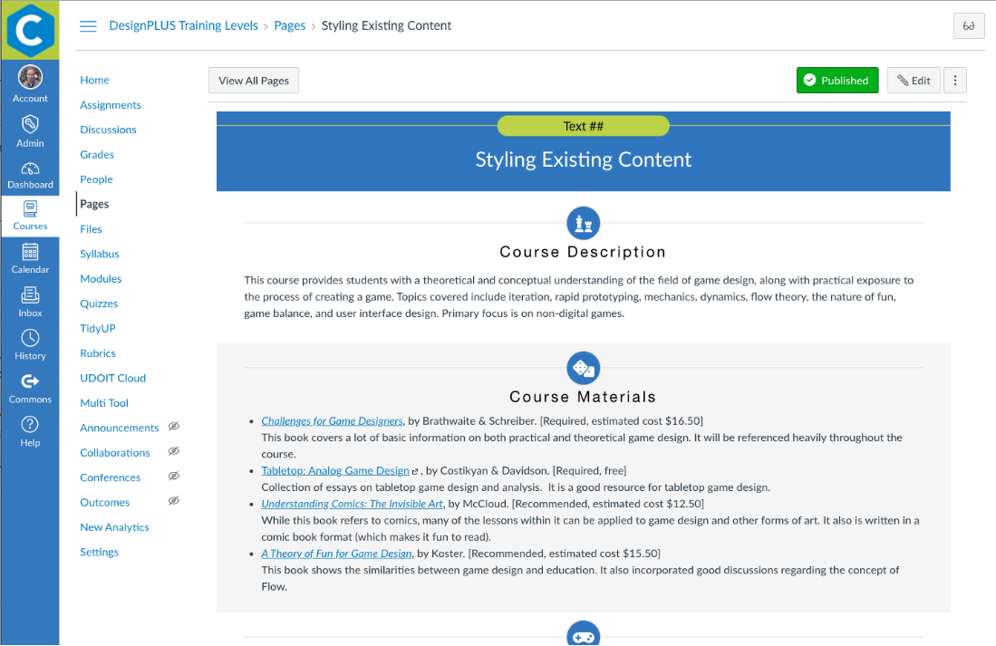
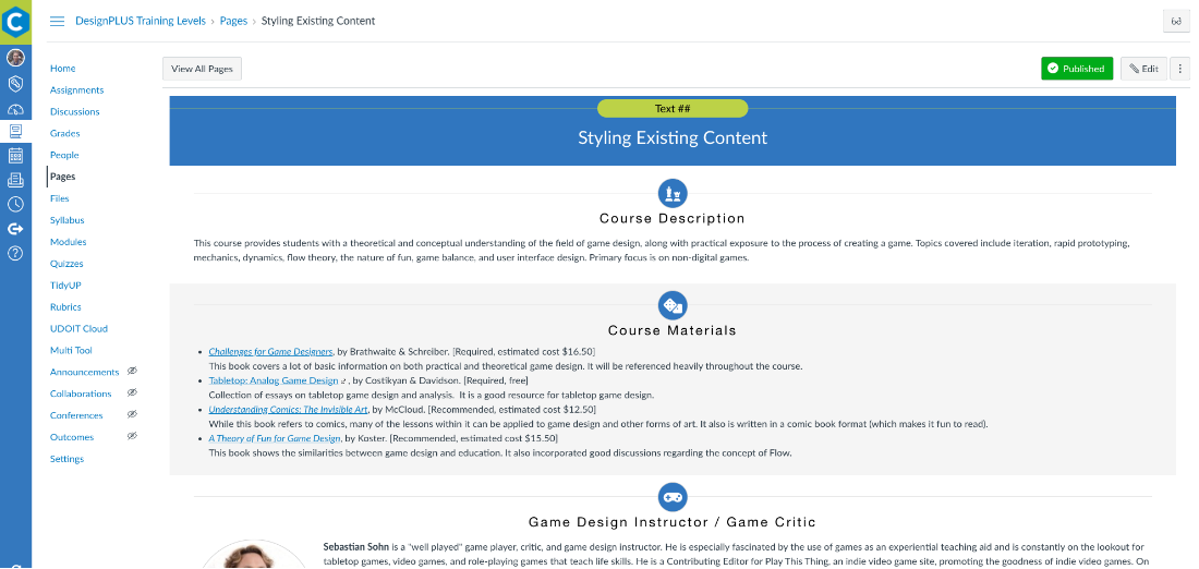
Quite a few years back, Canvas introduced the New User Tutorial feature option in the root account settings. This feature had an unusual side effect. When this feature is enabled, Canvas content fills the full width of the browser. While this may sound like a positive thing, it made user content that was previously a nice comfortable width like this:

Look like this, where the paragraphs become hard to read on larger monitors and banner images become huge:

To prevent this from creating problems with existing courses, we enforced a maximum width on the Canvas user content to prevent that from happening. Because I didn't want to go to the far edge of the browser to find the edit button, that maximum width was set on the user content area rather than just the Design Tools content.
We have seen a recent increase in new Cidi Labs customers that have been using Canvas who are using the New User Tutorial feature who panic when all of their content now has a maximum width. In addition, in the February 3, 2021 Canvas deploy applied that width to all Canvas users.
Since my goal is to have as little of an impact on Canvas outside of the content we help you create, I have removed the width limit from the Canvas content container. However, since I firmly believe that limiting the width has better usability, the maximum content width will still be applied to the Design Tools Wrapper.
