How can DesignPLUS help me utilize whitespace on pages?
As was mentioned in the Cidi Labs presentation at InstructureCon 2022, "In an uncluttered course, items are clearly labeled, content is presented in manageable chunks, and the visual design is clean with ample whitespace [emphasis added]. All of these elements of course design reduce the cognitive load on students, allowing them to more fully engage with the learning." (Cidi Labs, 2022). Effective use of whitespace can greatly improve the readability of a course, making it easier for students to use.
If you're still not convinced, take a look at some specific benefits of whitespace in web design by reading Myth #28 from UX Myths, which includes links to several research articles as well.
DesignPLUS offers several tools that can help utilize the whitespace on your Canvas pages.
Spacing Tool
(Customize the Style > Current Element Style > Spacing)
The Spacing tool allows you to adjust the padding (space inside the edges) and margin (space outside the edges) of any element on the page. Since many editors do not allow you to adjust margins, users may be in the habit of repeatedly pressing the Enter key to create empty paragraphs to simulate whitespace. With DesignPLUS, you can create proper whitespace in any direction by increasing the margin around elements.
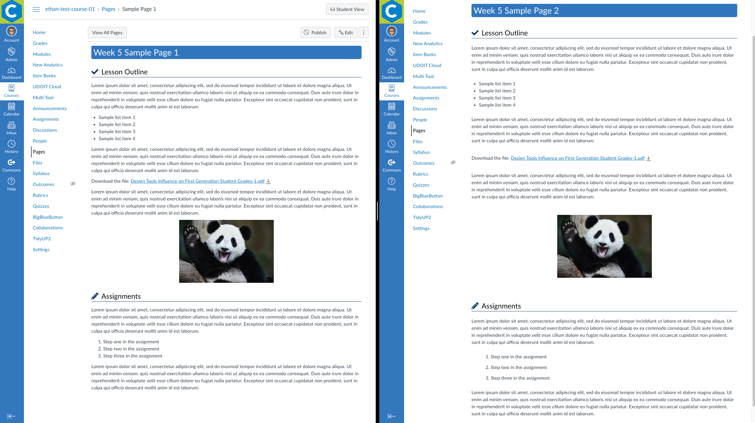
The Canvas screenshot below shows the same page twice. The window on the left has standard styling, and the window on the right has increased margins for more whitespace. Although it makes the page longer, the extra margins make each element on the page easier to browse.

Visit the DesignPLUS User Guide to learn how to use the Spacing tool.
Column Layouts
(Add Advanced Elements > HTML Snippets > Design Tools Core Snippets)
Many Canvas users wish to use horizontal space in page design. With the limitations of the native Rich Content Editor options, this is usually achieved by creating tables. However, tables are difficult to style properly and are not responsive to smaller screen sizes. DesignPLUS offers users a responsive column layout option that is much simpler to use and collapses columns on small screens, making content optimized for the mobile app. One additional consideration is to make all the content in a column row viewable at once so that students don't have to scroll back and forth to read through column contents.
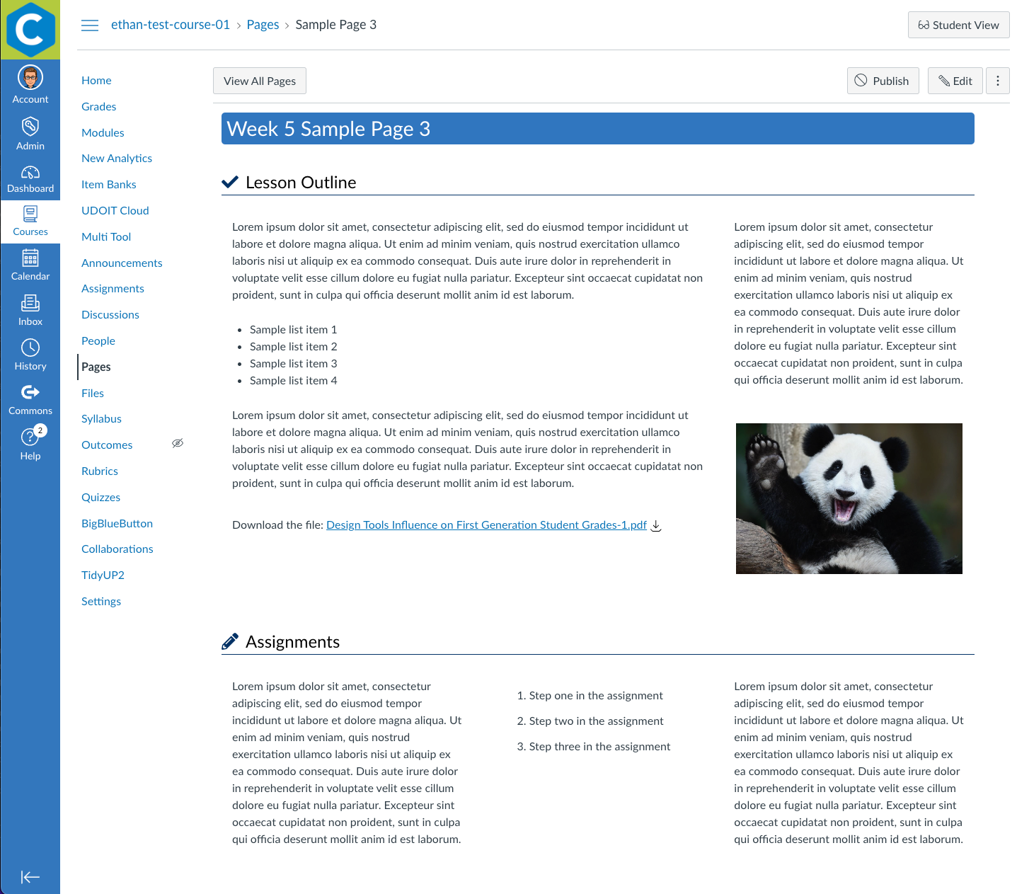
The Canvas screenshot below shows the sample page that has added margins, but with column layouts in both of the content blocks. Notice how utilizing the horizontal space reduces the length of the page. If this page were loaded on a smaller screen size or in the mobile app, the columns would stack into one column, starting from left to right.

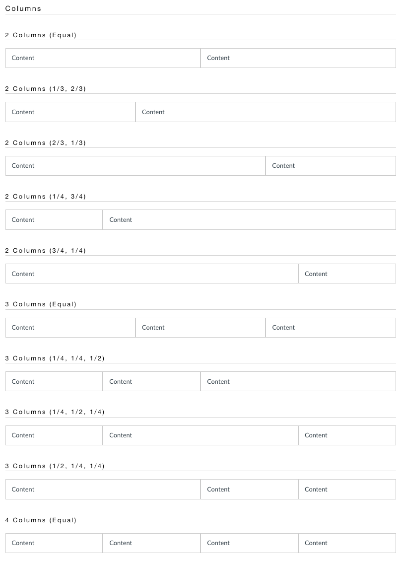
Column layouts come in several different 2, 3, or 4 column presets. The Canvas screenshot below shows each of the presets available.

Visit the DesignPLUS User Guide to learn how to use column layouts.
Accordions
(Add Advanced Elements > Accordions | Tabs)
Finally, accordion widgets are a great way to conserve space on a page. Keep in mind that these expanding panels are ideal for optional information, quick references, or additional resources. Rather than having these elements take up real estate on the page, you can use a DesignPLUS accordion widget to collapse them into a clean, sophisticated text feature.
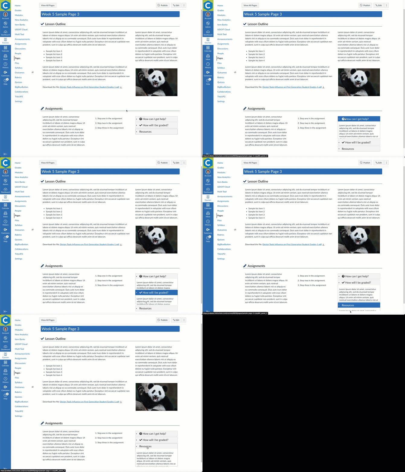
The animation below shows how our sample page can use an accordion to declutter a content block.

Visit the DesignPLUS User Guide to learn how to use the Accordion tool.
Conclusion
We hope that you'll find these tools useful as you strive to increase readability and usability in the online courses at your institution. And remember, whitespace is not wasted space!
References
Cidi Labs. (2022). Easy does it! Increasing student engagement with a focus on usability. Retrieved from https://www.instructure.com/canvas/resources/data-analytics/easy-does-it-increasing-student-engagement-with-a-focus-on-usability
Kollin, Z. (n.d.). Myth #28: White space is wasted space. Retrieved from https://uxmyths.com/post/2059998441/myth-28-white-space-is-wasted-space
