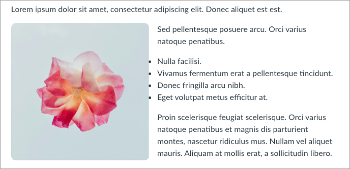
Why isn't there space between my list and a left-floated image?
The classes needed to float an image don't always play nicely with lists, and require a workaround.
Unfortunately, images floated to the left of lists won't display an ideal margin by default; however, there is a workaround in DesignPLUS!

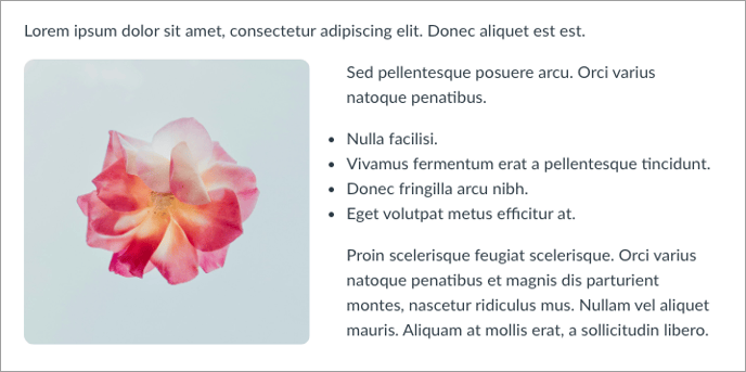
The Fix: Adjust the Image's Margins
We can easily adjust the margins of the image in DesignPLUS, to provide more space between the image and the list:
- If you haven't already enabled the Advanced tools in your DesignPLUS sidebar:
- Select the "More Options" kebab menu (three vertical dots) in the upper right of the sidebar.
- Select User Settings.
- Select the checkbox for "Enable all Advanced Tools."
- Select the image in the Canvas Rich Content Editor.
- Then select the Advanced tab in the sidebar.
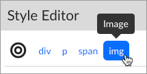
- Choose Style Editor.
- Ensure that the target is set to img (Image).

- Scroll to the bottom of the options. In the Advanced panel, inside the Classes, find and delete "me-3".

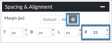
(Note: This will temporarily make the margins/spacing look even worse, but it's a required step!) - Expand the Spacing & Alignment panel (just above the Advanced panel).
- Next to Margin (px), select the four-way arrow button, and input a numerical margin (example: 35) for R (right) field.

- Save the page.
